01. The Goal
Update the user experience into something more modern and unique which would appeal to the hip independent developer audience. Educate the public about the AI APIs that Microsoft offers.
The problem: The website was thrown together by developers without much thought for the target audience or the user experience. It needed to have some thought applied to it in order to perform better.
The team: Project Manager, UX Designer (me!), Software Developer, Software Development Manager
The tools I used: Illustrator, Invision, Photoshop, Visual Studio, HTML/CSS/LESS
The deliverables: Business requirements document, sitemap, mobile and desktop wireframes, prototype, visual designs, single page template coded (HTML, CSS, LESS), design guidelines document
Discovery
The client had done a lot of the preliminary research, including user research, information architecture, and a first draft of wireframes. However, they were designing without a goal. So we took a step back to establish their goal (update their website to drive adoption from their target audience) and success metrics (increased downloads of their APIs). The work that the client had already completed was useful but involved a massive amount of information that needed to be condensed. I took their user research and created a single target persona, analyzed their information architecture and adjusted it with the new goal in mind, and then began the work on the pages.
02. Desktop Experience
Because the target audience was hip, modern developers, we wanted a website that spoke to them. As most developers will be coding on a desktop device, and do any research on a desktop device, we really wanted to make sure that the desktop experience was clean and inviting.
03. Mobile Experience
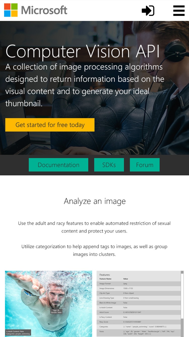
Even though we anticipated that this site would get used more on a desktop device, we knew that our hip modern developer target audience were definite power mobile users. Therefore, we also made sure the mobile experience was just as seamless as the desktop.
04. The Process
Some wireframes had been created by the client, but they were not adequate for meeting the client’s goal, so we started over. Working in Illustrator, we created detailed wireframes that laid out the pages, paying special attention to the hierarchy of the content and the flow of each page’s content. We added important content like a clear pricing table and an easy to use demo of the API. Each API page would end in content that drove the user to either download the API or dive deeper into the content of the site, exploring the capabilities of the Microsoft AI APIs. Once the wireframes were completed, we created a prototype in Invision that allowed us to conduct moderated usability studies on the pages with our target users.
05. Final
The moderated usability study gave us a good idea of what the users were expecting for this site. When we analyzed the results, it turned out that there were only small changes in the content that needed to be adjusted before moving on to the visual design phase. The visual design was created in Photoshop, using the Microsoft brand standards but pushing the limit of it in order to feel more modern and innovative. We settled on a color palette of teal and yellow, setting us apart from other Microsoft sites that tended to be blue or red. On approval of the visual design, I created a style guide document and coded the main page template using HTML, CSS, and LESS so the client would have a guide when developing the remaining pages.


